I had 20 years to eat at Noah’s Ark restaurant in St. Charles before it closed in 2000, but I never did. With a lot of land and a highly visible location developers were interested. New Urbanist developer Greg Whittaker, of New Town at St. Charles, bought the site. He hired Duany Platter-Zyberk (DPZ) to plan a New Urbanist project to be called Plaza at Noah’s Ark.
December 2006:
The multi-use development is planned on 26.8 acres occupied by the former Noah’s Ark restaurant and motel and a small subdivision. The area was developed in the 1960s, but the restaurant closed in 2000 and the hotel two years later.
Plans include an 18-story high-rise residential complex, an outdoor ice rink, a movie theater, a 150-room upscale hotel, restaurants and a parking garage that could include 1,827 spaces. (Post-Dispatch)
March 2007:
The 26.8-acre high-density development is planned for the site of the former Noah’s Ark restaurant and motel at the southeast corner of the Interstate 70 and South Fifth Street interchange. Plans call for an 18-story residential building with a minimum of 518 units costing about $250,000 each, retail shops, a movie theater, a 10- to 14-story hotel, an outdoor ice rink and a multilevel, vertical parking garage. (Post-Dispatch)
November 2011:
The site plan allows for 17 buildings, as many as 12 of which would be one or two stories tall. None would be taller than six stories.
An earlier plan called for 27 buildings ranging from one to 18 stories and set aside 374,200 square feet for commercial space and 759,600 for residential units.
Under the current plan, commercial square footage will range from 561,575 to 1,147,275. Residential square footage can be from 505,000 to 602,000, with an average unit size of 971 square feet.
Construction of the second building is expected to begin sometime in 2012, Buralli said. The 300,000-square-foot building would include the site’s 196 residential units. Cullinan doesn’t plan to sell any of the residential units for now. (Post-Dispatch)
April 2013:
Peoria, Ill.-based Cullinan bought the property in January 2007 from Whittaker Homes, which had acquired the site for a project then called the Plaza at Noah’s Ark. Cullinan renamed it and reached a new development agreement with the city, but the recession delayed construction. The City Council in January 2010 approved $40 million in bonds to help get it going, and in July 2011 approved a revised plan calling for more commercial square footage, less residential space and fewer buildings than Whittaker proposed. (Post-Dispatch)
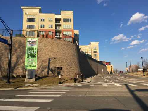
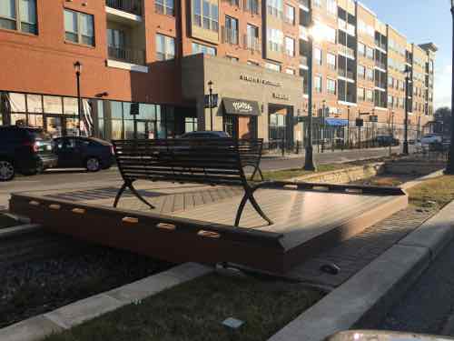
A few years ago I saw it after the first building was completed, earlier this month I returned when we were in the area. My reaction is best described as mixed.
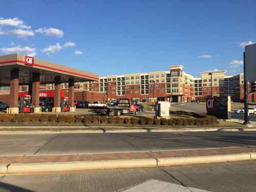
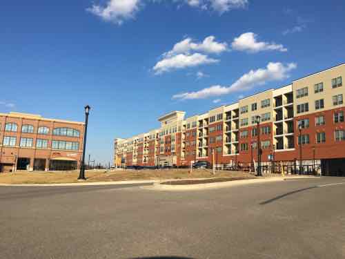
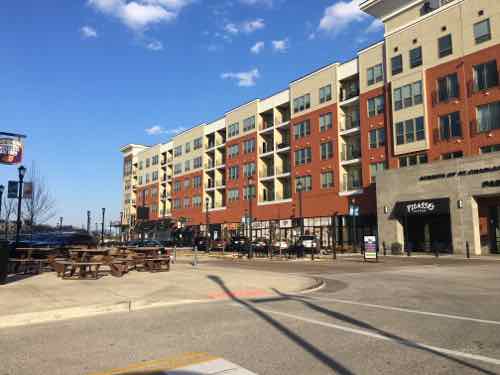
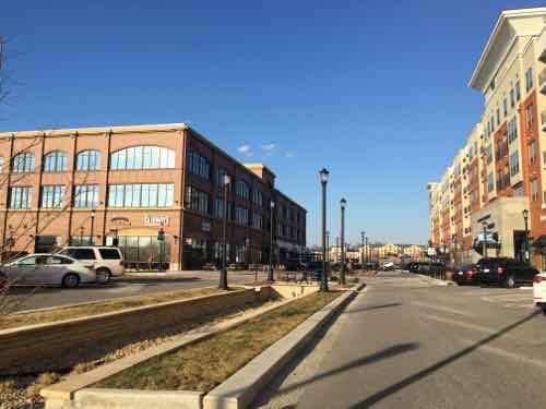
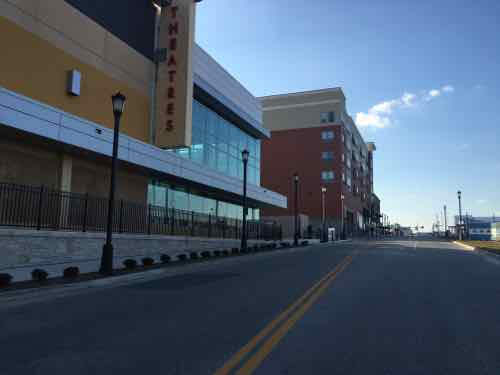
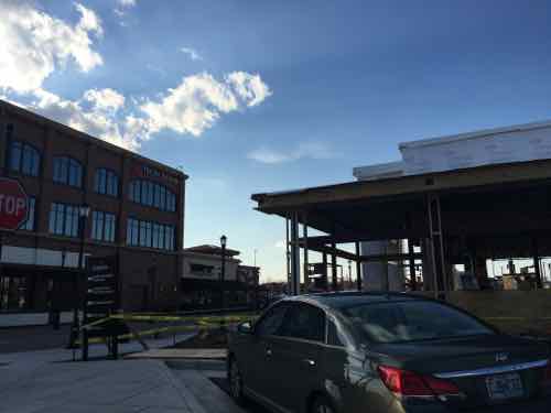
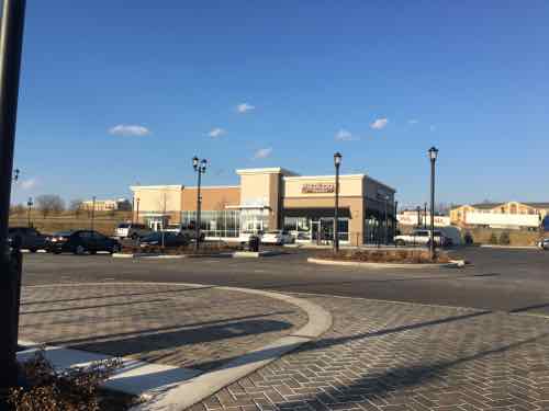
Looking North from 5th & Main. Note the banner on the tall retaining wall “Indulge in Urban Living”. Click image for official websiteFrom 5th StreetUp the hill from the QT, still room for future buildings .Beale Street has multi-story buildings on both sides with street-level retail storefrontsAnother view of Beale Street. The first building is on the left, has offices over retailThe AMC theater is strikingly modern compared to the other buildingsA new 1-story PF Change is under construction to the North of the original buildingFurther North is another 1-story building with Missouri’s first Pieology pizza chain. Click image for Sept 2015 articleDespite what appears to be decent pedestrian circulation, there are several areas that aren’t accessible to everyone
As I said, I have mixed feelings on this project. As a 25+ year resident of the City of St. Louis, their slogan “Indulge in Urban Living” is laughable to me. But I know I’m not their target market. To most residents of St. Charles County this is more urbanity than they ever thought they’d see on their side of the Missouri River.
A decade or more ago this site would’ve been developed as a big box with an even bigger parking lot. Smaller buildings would’ve dotted the perimeter. Visitors would’ve been expected to arrive via car and to drive to reach other buildings on the site. From my brief observations, it appears the planners have made sure pedestrians can reach every building via a sidewalk.
While I’m not going to give up my downtown loft to live here, it’s an improvement over old-school development patterns.
I’d love to visit in my wheelchair so I could experience it as a pedestrian. It appears I can catch the St. Charles Area Transit’s I-70 Commuter bus at North Hanley, which I’ll do in the coming month or two. A few hours exploring the site, touring a model apartment, having lunch will give me a better feel of the project.
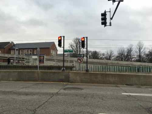
For a while now I’ve been trying to convey how disastrous light rail in the center of Natural Bridge & Jefferson would be. I kept trying to think of a local example, but then the 2006 light rail extension in the center of Forest Park Parkway in Clayton came to mind.
Southbound traffic on S. Meramec in Clayton see a wall and right turn only signs at Forest Park Parkway. Click to view in Google Street ViewTo achieve higher speeds,places to cross would be reduced through the use of concrete walls.
Such walls preventing pedestrians, bicyclists, and motorists and crossing the street except at a few points would be horrible for the surrounding neighborhoods. Do as I did — go to the interception of Meramec & Forest Park Parkway and see if you think that would be good for Natural Bridge or Jefferson.
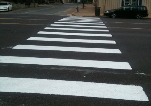
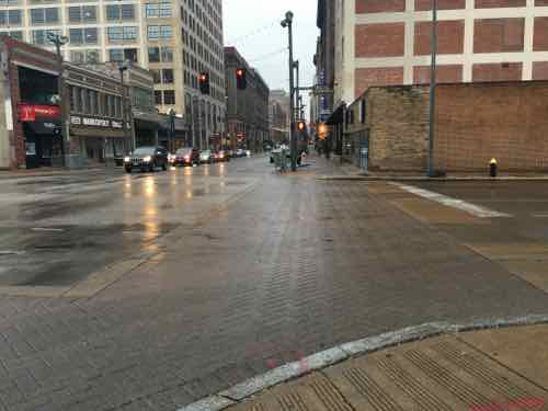
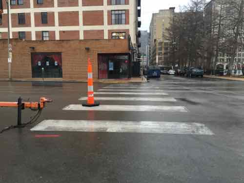
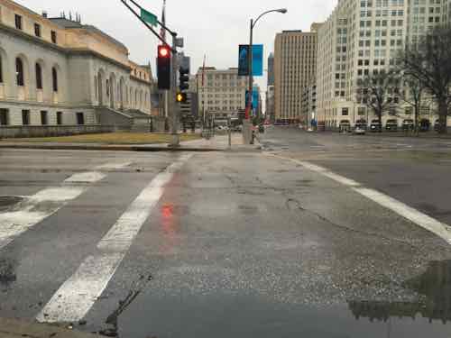
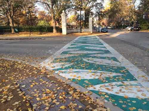
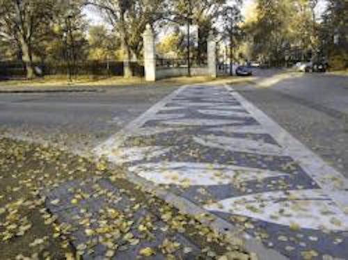
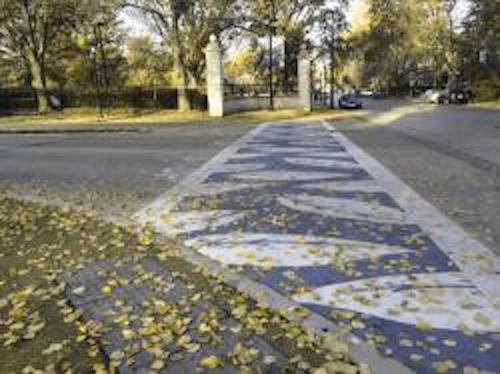
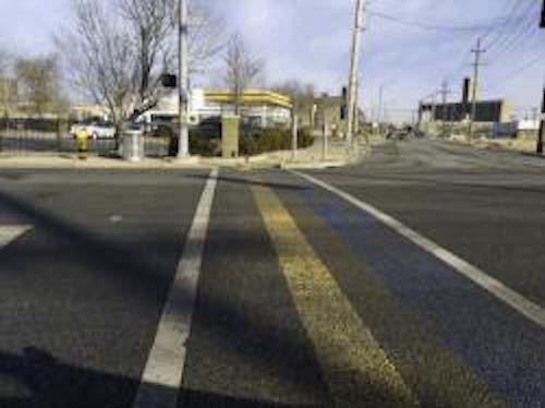
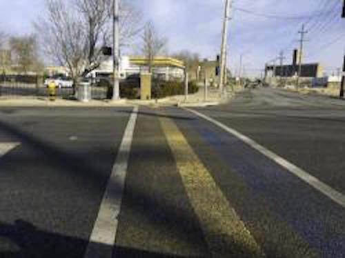
Monday, in Part 1, I explained why St. Louis officials shouldn’t be shocked their colorful art crosswalks don’t meet federal guidelines. They’re less visible than the classic bright white “continental” crosswalk.
Decorative crosswalk crossing Manchester at Sarah was installed in 2015From 2011: A freshly painted “continental” crosswalk at 17th & Olive
8.5 Crosswalks Crosswalks are a critical part of the pedestrian network. A crosswalk is defined as “the portion of a roadway designated for pedestrians to use in crossing the street” (Institute of Transportation Engineers, 1998). Crosswalks are implied at all intersections whether or not they are marked. Midblock crossings include all marked crosswalks that do not occur at intersections. Midblock crossings are only created if a marked crosswalk is provided. The agency responsible for the roadway must ensure that all marked and unmarked crosswalks and midblock crossings are optimized for the safety and accessibility of all pedestrians.
8.5.1 Crosswalk markings Crosswalk markings, if provided, are used to define the pedestrian path of travel across the roadway and alert drivers to the crosswalk location. Marked crosswalks should be designed in accordance with the Manual of Uniform Traffic Control Devices (MUTCD). Although the MUTCD provides options for crosswalk markings, the continental design is recommended because research indicates that it is the most visible to drivers (Knoblauch et al., 1988). The ladder design is created with white longitudinal lines at a 90 degree angle to the line of the crosswalk. The lines should be approximately 305 mm to 610 mm (12 in to 24 in) wide and spaced 305 mm to 610 mm (12 in to 24 in) apart (USDOT, 1988). The continental design can also be installed so that the primary paths for vehicular tires are between the crosswalk markings, which helps to reduce wear and maintenance. Use of the continental design for crosswalk markings also improves crosswalk detection for people with low vision and cognitive impairments. It is recommended that the continental design be used consistently to mark all crosswalks; otherwise the impact of less visible markings may be weakened by comparison.
They make it very clear that “continental” crosswalk markings are preferred. The design is such that, if properly done, allows vehicle tires to roll over the non-painted areas — thus reducing wear on the paint. The last sentence above is worth repeating:
“It is recommended that the continental design be used consistently to mark all crosswalks;
otherwise the impact of less visible markings may be weakened by comparison.”
Crosswalk markings downtown are anything but consistent, the continental marking is rare.
While pedestrians generally have the right to cross at any intersection regardless of crosswalks, designers should be sensitive to the misperception that a crosswalk is the only legal place to cross the street. Use crosswalks as both a guide for pedestrians and a way to communicate crossings to motorists.
The practice of discouraging pedestrian crossings by leaving uncontrolled crossings unmarked is not a valid safety measure. Instead, it encourages unsafe, risk-taking behavior and discourages walking citywide. Efforts should be made to enhance or highlight desired crossings wherever practicable. Hybrid beacons, rapid flash beacons, raised crossings, medians, and other safety counter-measures may be suitable and less expensive than full signalization. These should all be considered before leaving an uncontrolled crossing unmarked.
But we can’t afford to mark every possible crossing point — how do we determine when to mark and when to leave unmarked?
All legs of signalized intersections must have marked crosswalks unless pedestrians are prohibited from the roadway or section thereof, or if there is physically no pedestrian access on either corner and no likelihood that access can be provided. Pedestrians are unlikely to comply with a 3-stage crossing and may place themselves in a dangerous situation as a result.
Let’s look at 14th Street from Washington Ave to Olive Street to see how inconsistent St. Louis is with crosswalks:
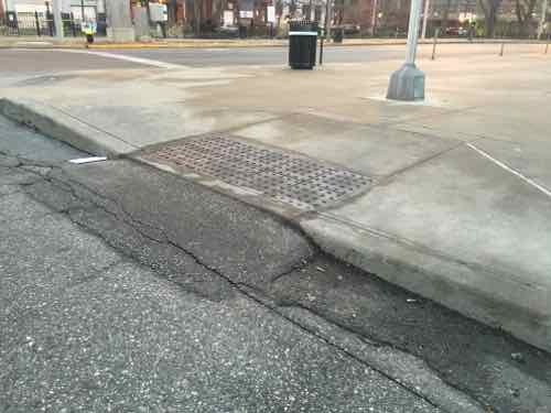
Crossing 14th at Washington Ave the decorative brick crosswalk isn’t as visible as the bright white continental designAt St. Charles Street (glorified alley) there’s no signal, no stop sign. There are two continental crosswalksThe North side of Locust at 14th, a signalized intersection, has no crosswalk markingThe South side of Locust at 14th is the same — n o crosswalk marking. Behind ,me is a school, the main library across 14th.An aside — the unmarked crosswalk leads to a non-compliant curb ramp that I pointed out prior to completion of the library.Olive at 14th is the basic parallel white lines. Still more visible than the expensive decorative brick crosswalk at Washington Ave
I’d like to think St. Louis’ new bike/ped coordinator will be able to make a difference — but for so long pedestrians got half-ass infrastructure. Not sure one bureaucrat can change the culture.
Last week crosswalks were in the local news — specifically colored decorative crosswalks. St. Louis’ new bike/pedestrian coordinator, engineer Jamie Wilson, found out these weren’t compliant with federal standards:
Wilson said it was a shock to St. Louis as well as cities all over the country who employed the colorful crosswalks for aesthetic purposes but also as a way to make them pop for drivers.
“That was the intention,” said Wilson.
But now they will have to return to the more common white lines. There are some variations, but nothing like the painted works of art common around the city.
Wilson says they have turned down any new plans for similar crosswalks and will not maintain the current ones. Instead, they will be replacing them as needed. (KMOV)
Regular readers know I post often about crosswalks. So it’s no surprise I took interest in this news item and wanted to learn more. The news report made it sound like the city received a letter from the DOT.MoDOT? US DOT? So I asked Wilson:
I heard about it during a nationally broadcasted pedestrian safety webinar in early November. It was mentioned in the webinar and other cities participating immediately began inquiring as to the whereabouts of this memo and what it meant to everyone. After that I got the memo and read it – then I notified others at the City. Since that time we have not allowed any new designs to be reviewed/permitted that aren’t consistent with the FHWA approach. (Via email 1/28/2016)
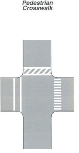
From the MUTCD, click to view page: “The “Pedestrian Crosswalk” figure shows three styles of crosswalk markings shown at a roadway intersection. On the west side of the vertical roadway, a crosswalk is shown marked at the intersection with two parallel solid white lines. On the east side of the horizontal roadway, a crosswalk is shown marked at the intersection with solid white diagonal lines between two parallel solid white lines. On the east side of the vertical roadway, a series of closely spaced solid white lines are shown placed at the intersection parallel to the direction of travel. A note states that the spacing of the lines is selected to avoid the wheel path of vehicles.”
The memo is an interpretation ruling by the Federal Highway Administration (FHA) of the Manual of Uniform Traffic Control Devices (MUTCD): Official Ruling 3(09)-24(I) – Application of Colored Pavement. From the very detailed ruling dated August 15, 2013:
The FHWA’s position has always been, and continues to be that subdued-colored aesthetic treatments between the legally marked transverse crosswalk lines are permissible provided that they are devoid of retroreflective properties and that they do not diminish the effectiveness of the legally required white transverse pavement markings used to establish the crosswalk. Examples of acceptable treatments include brick lattice patterns, paving bricks, paving stones, setts, cobbles, or other resources designed to simulate such paving. Acceptable colors for these materials would be red, rust, brown, burgundy, clay, tan or similar earth tone equivalents. All elements of pattern and color for these treatments are to be uniform, consistent, repetitive, and expected so as not to be a source of distraction. No element of the aesthetic interior treatment is to be random or unsystematic. No element of the aesthetic interior treatment can implement pictographs, symbols, multiple color arrangements, etc., or can otherwise attempt to communicate with any roadway user.
Patterns or colors that degrade the contrast of the white transverse pavement markings establishing the crosswalk are to be avoided. Attempts to intensify this contrast by increasing or thickening the width of the transverse pavement markings have been observed in the field. These attempts to increase contrast are perceived to be efforts to circumvent the contrast prerequisite so that an intentional noncompliant alternative of an aesthetic interior pattern or color can be used. Further techniques to install an empty buffer space between an aesthetic treatment and the interior edge of the white transverse crosswalk markings have also been observed in the field. This strategy is also perceived to be an attempt to circumvent FHWA’s prior position on contrast. However, an empty buffer space between a subdued-colored, uniform-patterned aesthetic treatment can be implemented to enhance contrast between the aesthetic treatment and the white transverse pavement markings. When used properly, buffer spaces can be an effective tool to disseminate a necessary contrast in order to visually enhance an otherwise difficult to discern white transverse crosswalk marking, provided that the aesthetic treatment conforms to the conditions in the preceding paragraph.
So we found out over two years after the fact! In researching I found a similar interpretation letter from May 2011. What are the guidelines being interpreted? From the 2003 manual:
Crosswalk markings provide guidance for pedestrians who are crossing roadways by defining and delineating paths on approaches to and within signalized intersections, and on approaches to other intersections where traffic stops.
Crosswalk markings also serve to alert road users of a pedestrian crossing point across roadways not controlled by highway traffic signals or STOP signs.
At nonintersection locations, crosswalk markings legally establish the crosswalk.
[snip]
For added visibility, the area of the crosswalk may be marked with white diagonal lines at a 45-degree angle to the line of the crosswalk or with white longitudinal lines parallel to traffic flow. When diagonal or longitudinal lines are used to mark a crosswalk, the transverse crosswalk lines may be omitted.
You can see the full section here. It clearly states the two options for added visibility. Two. See the graphic, at right. The current edition is the 2009 MUTCD with revisions 1 & 2, May 2012 — this language is nearly identical to the 2003 language.
How anyone got that is was ok to do decorative/colored patterns from the 2003/2009 guides is beyond me. But a dozen years after the 2003 MUTCD is published, four+ years after one interpretation, the city is “shocked.”
I’m not shocked at all — the city comes at pedestrian infrastructure from a motorist’s viewpoint. Pedestrian experts have long-known crosswalk markings help guide pedestrians — especially those with limited vision. High contrast (white on black) is the key to ensure low vision pedestrians know where to cross the street. This same high contrast helps motorists see a crosswalk ahead.
Let’s take a look at some crosswalks.
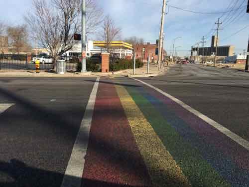
From 2011: A freshly painted crosswalk at 17th & Olive This design is the most visible for everyone. Cities trying to make areas more pedestrian-friendly make sure all signalized intersections use this “continental” design,At Washington & Tucker there isn’t a compliant crosswalk marking. Not everyone can distinguish the brick pavers. Someone walking on the far left of the pavers is in the right traffic lane of Washington Ave and would likely get hit.Crosswalk at the entrance to the Missouri Botanical Gardens uses mostly white with green fill. Because of the white, it’s very visibleColor blindness simulation: People with protanopia lack the long-wavelength sensitive retinal cones that are required to distinguish between colors in the green-yellow-red section of the spectrum. Click image to see simulator websiteColor blindness simulation: People with dueteranopia lack medium-wavelength retinal cones and are therefore also unable to distinguish between colors in the green-yellow-red section of the spectrum.Rainbow crosswalk crossing Manchester at Sarah was installed in 2015Protanopia colorblindness simulationDueteranopia colorblindness simulation looks nearly identical, it’s the white that pops
Colorblindness is easy to simulate online, but the numerous types of vision loss are not. The following video demonstrates.
Macular Degeneration
Cataracts
Glaucoma/Retinitis Pigmentosa
Diabetic Retinopathy
Hemianopsia (caused by stroke, tumor, or trauma)
For a few years now I’ve had early cataracts, not yet bad enough for corrective surgery.
If the goal is visibility crosswalks should use white — the “continental” design. Public art is great — just not in crosswalks. More on crosswalk on Thursday.
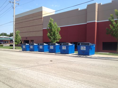
Over two years ago I posted about recycling dumpsters blocking a public sidewalk on the West side of Target, At the time Clifton Ave was being resurfaced so I wasn’t sure if they were on the sidewalk temporarily.
September 2013: The six recycling bins, oriented to the street, viewed from across Clifton Ave
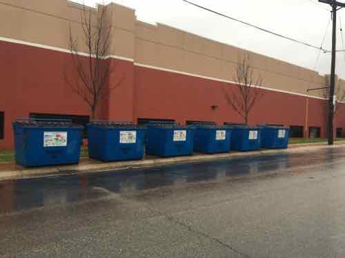
In the time since I’ve noticed them still on the sidewalk, but I was passing by on Chippewa and couldn’t get a picture. Yesterday, Target had the Chippewa entrance to the lower level parking closed, so we turned onto Clifton Ave. — so I stopped the car to get a pic.
December 27, 2015. Click image to view in Google’s Street View
Recycling is important, but so are pedestrians! All pedestrians should be able to go from Chippewa to Bancroft — that’s why the sidewalk exists.
Here’s what needs to happen:
Move the bins into the street, OR
Add more sidewalk behind the bins, OR.
Relocate the bins elsewhere
I’d love to know who made the decision to block the public sidewalk.
AARP Livibility Index
The Livability Index scores neighborhoods and communities across the U.S. for the services and amenities that impact your life the most
Built St. Louis
historic architecture of St. Louis, Missouri – mourning the losses, celebrating the survivors.
Geo St. Louis
a guide to geospatial data about the City of St. Louis