St. Louis Fails At Crosswalks, Part 1
Last week crosswalks were in the local news — specifically colored decorative crosswalks. St. Louis’ new bike/pedestrian coordinator, engineer Jamie Wilson, found out these weren’t compliant with federal standards:
Wilson said it was a shock to St. Louis as well as cities all over the country who employed the colorful crosswalks for aesthetic purposes but also as a way to make them pop for drivers.
“That was the intention,” said Wilson.
But now they will have to return to the more common white lines. There are some variations, but nothing like the painted works of art common around the city.
Wilson says they have turned down any new plans for similar crosswalks and will not maintain the current ones. Instead, they will be replacing them as needed. (KMOV)
Regular readers know I post often about crosswalks. So it’s no surprise I took interest in this news item and wanted to learn more. The news report made it sound like the city received a letter from the DOT.MoDOT? US DOT? So I asked Wilson:
I heard about it during a nationally broadcasted pedestrian safety webinar in early November. It was mentioned in the webinar and other cities participating immediately began inquiring as to the whereabouts of this memo and what it meant to everyone. After that I got the memo and read it – then I notified others at the City. Since that time we have not allowed any new designs to be reviewed/permitted that aren’t consistent with the FHWA approach. (Via email 1/28/2016)
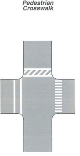
“The “Pedestrian Crosswalk” figure shows three styles of crosswalk markings shown at a roadway intersection. On the west side of the vertical roadway, a crosswalk is shown marked at the intersection with two parallel solid white lines. On the east side of the horizontal roadway, a crosswalk is shown marked at the intersection with solid white diagonal lines between two parallel solid white lines. On the east side of the vertical roadway, a series of closely spaced solid white lines are shown placed at the intersection parallel to the direction of travel. A note states that the spacing of the lines is selected to avoid the wheel path of vehicles.”
The memo is an interpretation ruling by the Federal Highway Administration (FHA) of the Manual of Uniform Traffic Control Devices (MUTCD): Official Ruling 3(09)-24(I) – Application of Colored Pavement. From the very detailed ruling dated August 15, 2013:
The FHWA’s position has always been, and continues to be that subdued-colored aesthetic treatments between the legally marked transverse crosswalk lines are permissible provided that they are devoid of retroreflective properties and that they do not diminish the effectiveness of the legally required white transverse pavement markings used to establish the crosswalk. Examples of acceptable treatments include brick lattice patterns, paving bricks, paving stones, setts, cobbles, or other resources designed to simulate such paving. Acceptable colors for these materials would be red, rust, brown, burgundy, clay, tan or similar earth tone equivalents. All elements of pattern and color for these treatments are to be uniform, consistent, repetitive, and expected so as not to be a source of distraction. No element of the aesthetic interior treatment is to be random or unsystematic. No element of the aesthetic interior treatment can implement pictographs, symbols, multiple color arrangements, etc., or can otherwise attempt to communicate with any roadway user.
Patterns or colors that degrade the contrast of the white transverse pavement markings establishing the crosswalk are to be avoided. Attempts to intensify this contrast by increasing or thickening the width of the transverse pavement markings have been observed in the field. These attempts to increase contrast are perceived to be efforts to circumvent the contrast prerequisite so that an intentional noncompliant alternative of an aesthetic interior pattern or color can be used. Further techniques to install an empty buffer space between an aesthetic treatment and the interior edge of the white transverse crosswalk markings have also been observed in the field. This strategy is also perceived to be an attempt to circumvent FHWA’s prior position on contrast. However, an empty buffer space between a subdued-colored, uniform-patterned aesthetic treatment can be implemented to enhance contrast between the aesthetic treatment and the white transverse pavement markings. When used properly, buffer spaces can be an effective tool to disseminate a necessary contrast in order to visually enhance an otherwise difficult to discern white transverse crosswalk marking, provided that the aesthetic treatment conforms to the conditions in the preceding paragraph.
So we found out over two years after the fact! In researching I found a similar interpretation letter from May 2011. What are the guidelines being interpreted? From the 2003 manual:
Crosswalk markings provide guidance for pedestrians who are crossing roadways by defining and delineating paths on approaches to and within signalized intersections, and on approaches to other intersections where traffic stops.
Crosswalk markings also serve to alert road users of a pedestrian crossing point across roadways not controlled by highway traffic signals or STOP signs.
At nonintersection locations, crosswalk markings legally establish the crosswalk.
[snip]
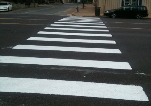
For added visibility, the area of the crosswalk may be marked with white diagonal lines at a 45-degree angle to the line of the crosswalk or with white longitudinal lines parallel to traffic flow. When diagonal or longitudinal lines are used to mark a crosswalk, the transverse crosswalk lines may be omitted.
You can see the full section here. It clearly states the two options for added visibility. Two. See the graphic, at right. The current edition is the 2009 MUTCD with revisions 1 & 2, May 2012 — this language is nearly identical to the 2003 language.
How anyone got that is was ok to do decorative/colored patterns from the 2003/2009 guides is beyond me. But a dozen years after the 2003 MUTCD is published, four+ years after one interpretation, the city is “shocked.”
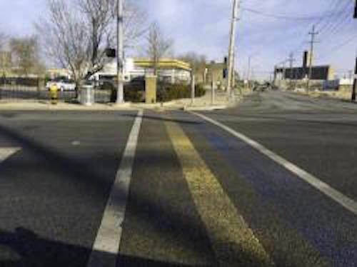
I’m not shocked at all — the city comes at pedestrian infrastructure from a motorist’s viewpoint. Pedestrian experts have long-known crosswalk markings help guide pedestrians — especially those with limited vision. High contrast (white on black) is the key to ensure low vision pedestrians know where to cross the street. This same high contrast helps motorists see a crosswalk ahead.
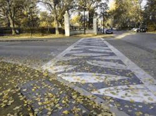
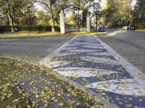
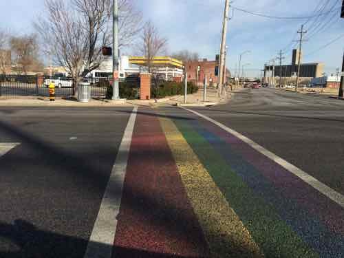
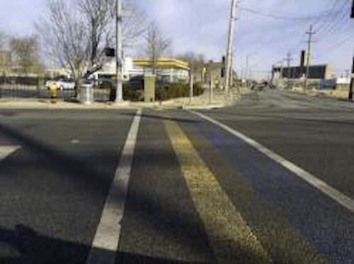
Let’s take a look at some crosswalks.
Colorblindness is easy to simulate online, but the numerous types of vision loss are not. The following video demonstrates.
- Macular Degeneration
- Cataracts
- Glaucoma/Retinitis Pigmentosa
- Diabetic Retinopathy
- Hemianopsia (caused by stroke, tumor, or trauma)
For a few years now I’ve had early cataracts, not yet bad enough for corrective surgery.
If the goal is visibility crosswalks should use white — the “continental” design. Public art is great — just not in crosswalks. More on crosswalk on Thursday.
— Steve Patterson
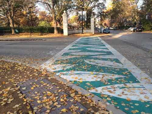
Those rainbow crosswalks in FPSE started to wear away a week after they showed up. Given that, I assumed they were just put down for pride week decoration rather than increased visibility. If that isn’t the case the city should get it’s money back. As for the ones at MoBOT they actually look pretty visible even in your colour blindness simulation.
Never the less, I agree, visibility should be the first concern with crosswalk markings. Beautification second.
The city didn’t pay for the pride crosswalks shown, The Grove CID did. City didn’t pay for the downtown pride crosswalks either.