Nearly a Quarter of St. Louis Households Underserved by Transit
Last month Streetsblog USA had a post that caught my attention:
Where should your city aim to add transit service? The places where more buses and trains will be most useful are areas where lots of people live or work, but there’s not enough service to meet the demand.
A new data tool from the Center for Neighborhood Technology helps pinpoint these locations in cities around the U.S. The “Gap Finder” — an extension of CNT’s All Transit database — overlays demographic data and transit schedule information on maps that highlight where more people would ride transit if service levels were higher.
The transit gaps mapped by CNT are not to be confused with “transit deserts” — areas with no transit at all. Areas with some transit service may still not have nearly enough to adequately serve the people who live or work there, while areas without any service may be so spread out that fixed-route transit won’t do much good. (Streetsblog USA)
They used three cities as examples: Miami, Los Angeles, and New York City — all had lots of underserved households — their maps were covered in red.
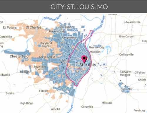
I wanted to see how St. Louis fared on AllTransit’s Gap Finder:
TRANSIT GAPS
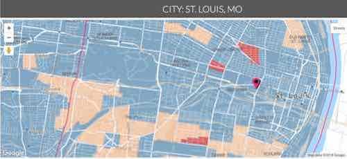
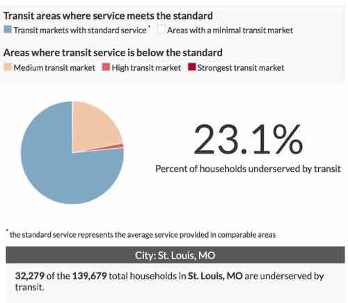
On the map above, any orange and red areas show transit markets where households are underserved by transit and would benefit from improvements. Blue areas indicate where the transit market strength is already met by a minimum benchmark of adequate transit service and white areas show where the market strength for transit service is low enough that adding transit would not represent an improvement. The pie chart shows the percentage of those households underserved by transit grouped by market strength.Note: The market is not the same as demand. The gap results from a comparison of current service to the standard or average transit service in similar neighborhoods – not the best and not the worst service, but average.
Why Are There Transit Gaps?
Transit gaps exist wherever there is a mismatch between the strength of a transit market and the quality of transit service available to the households of that community.
Calculating the Strength of Transit Markets
AllTransitTM defines the strength of a transit market by comparing a wide range of neighborhood characteristics to current transit service available in transit served areas with similar neighborhood characteristics.
I show the pie chart below, but first I want to get in closer.

Soi now what? How do we improve?
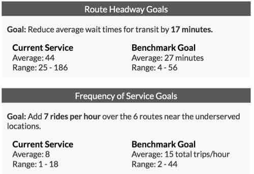
Reducing the average wait time for transit by 17 minutes for the underserved neighborhoods in St. Louis, MO would provide enough service improvement to meet minimum standards expected of the transit market in those areas.
Here’s more:
Every location and transit agency is unique, but generally one solution would be to increase the frequency of transit service along the existing (on average) 6 routes or adding new routes. Adding 7 rides per hourwould, on average, close the gap for the underserved areas in St. Louis, MO.
The measure of transit service is driven by the frequency of service, the distance to all transit stops, and the access to jobs on transit. For underserved areas in St. Louis, MO, increasing the average frequency of service from 8 to 15 total trips/hour would change the average transit service in underserved areas from 39 to 44 (out of 100).
The following summarizes headway & frequency goals:
I did not try to find flaws in their methodology. The purpose of this post us to inform others about this new tool and hopefully it’ll lead to improved service in St. Louis.
— Steve Patterson


